
When web designer Frances Berriman coined the term progressive web app in 2015, she said: “The name is for your boss, for your investor, for your marketeer.” In other words, we say it because it sounds cool (http://bkaprt.com/go/09-01).
And those three little words pack a powerful punch:
Marketing is not to be sniffed at when it comes to web technologies. For instance, back in 2004, web developers started using techniques to update parts of a page instead of refreshing the whole page—but it became much easier to talk about it once Jesse James Garrett coined the term Ajax to describe it.
Similarly, in 2010, when developers were struggling to make desktop websites work on mobile devices, Ethan Marcotte introduced the phrase responsive web design—and sparked a whole movement.
Of course, responsive web design wasn’t just a cool-sounding phrase. The technique had a clear definition that was made up of three parts: fluid grids, fluid images, and media queries. Likewise, the term progressive web app doesn’t just sound good in a meeting—it also has a clear definition, made up of three parts. For a website to qualify as a progressive web app, it must:
The good news is that you’ve already checked off two of the three actions in that to-do list. The even better news is that the third item is by far the easiest to achieve.
To start, create a blank file called manifest.json. I recommend storing it at the root level of your site (/manifest.json), just as you’ve done with your service worker script (/serviceworker.js).
This file will contain metadata: data about data. Historically, we’ve filled the head of HTML documents with metadata. But at some point, it started to get out of hand. There were lines of metadata specifically for Apple devices, more lines of metadata specifically for Android devices, and even more lines of metadata specifically for Windows devices.
To bring things back under control, we got the Web App Manifest. Its purpose is twofold. First, it standardizes the metadata, regardless of device manufacturer. Second, instead of repeating all that metadata in every HTML file, the metadata resides in one place.
Instead of filling the head of your HTML documents with lines and lines of metadata, you now only need one line: a link element with a rel value of "manifest" and an href value pointing to your file:
<link rel="manifest" href="/manifest.json">
Now web browsers know where to look for your manifest file.
A Web App Manifest has absolutely nothing to do with an AppCache manifest. I just wanted to make that clear, in case you’ve previously attempted to use AppCache (and if so, you have my sympathies). A Web App Manifest is a JSON file.
You’ve already written some JSON for your localStorage script. The JSON has curly braces on the outside and key/value pairs inside them:
{
    "key": "value",
    "other_key": "another value"
}
So a JSON file is actually a file containing a single JavaScript object. All of the key/value pairs are properties of the object. The property names (keys) of a Web App Manifest are being standardized by the World Wide Web Consortium (W3C):
This specification defines a JSON-based manifest file that provides developers with a centralized place to put metadata associated with a web application. This metadata includes, but is not limited to, the web application’s name, links to icons, as well as the preferred URL to open when a user launches the web application. (http://bkaprt.com/go/09-02/) Time to fill up this JSON file with metadata.
langStart by declaring the language of your website. If your site is in English, here’s how you declare that in your manifest file:
"lang": "en"
nameThe name property is pretty straightforward—it’s the name of your website:
"name": "My Website"
short_nameThe full name of your website might be a bit too long to fit in some spaces. Think about the space taken up by an application’s icon on a phone screen. Anything more than twelve characters runs the risk of being truncated. The short_name property allows you to specify the shortened alias of your site:
"short_name": "Website"
descriptionThe description property can be used to provide a sentence or two describing what your website does:
"description": "This is my website. There are many like it but this one is mine."
theme_colorThe theme_color property is nifty. You provide a color value that browsers can use to “fill in” their interface. Visitors to your site get a browser window customized to your site’s color scheme (Fig 9.1).

If your site has a solid color across the top, or uses a background color, that color value is a good candidate for this property. Give the value in the same way that you would declare a color in CSS. Here’s an example of a hexadecimal value for a nice shade of blue:
"theme_color": "#336699"
You can also provide this in a meta element in the head of your HTML documents if you like:
<meta name="theme-color" content="#336699">
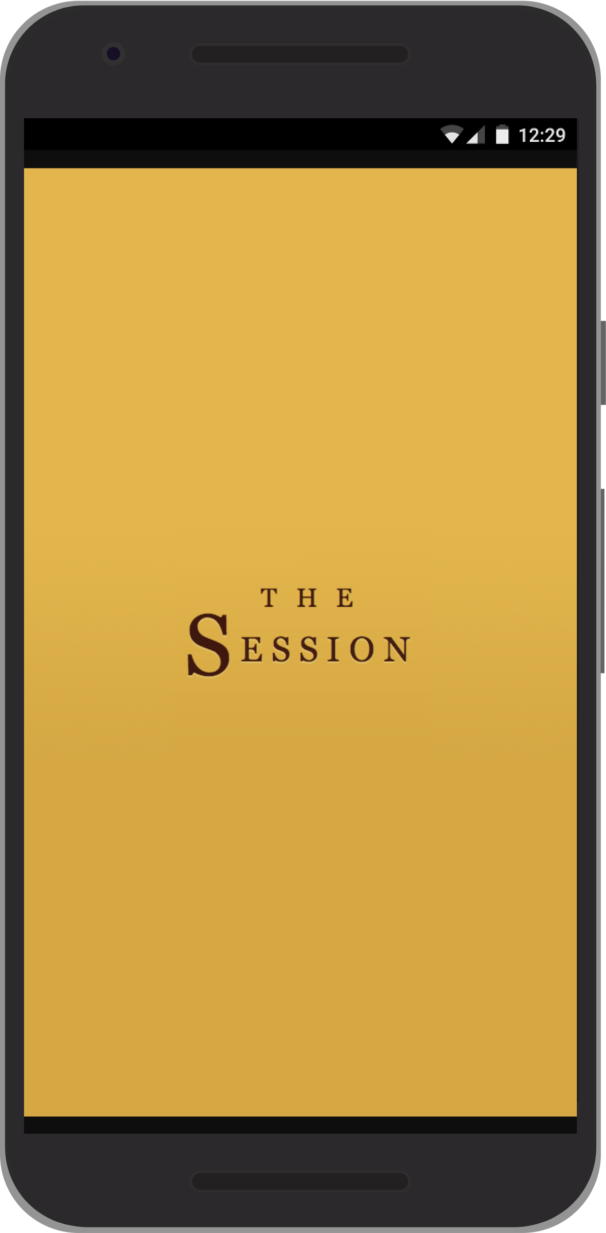
background_colorThe background_color property is similar to the theme_color property. A lot of the time, you can supply the same value for both properties. But think of the background_color property as the loading screen for your site (Fig 9.2). Choose a color to fill the screen that matches the branding of your site:
"background_color": "#336699"
start_urlIf someone were to bookmark your site, which URL would you like them to start from? For most sites, this will be the homepage, but you have the option of specifying any page using the start_url property:
"start_url": "/"
displayIf someone has bookmarked your website, then (on some mobile devices) this property determines how your site will launch when the bookmark is activated:
"display": "standalone"
The display property accepts one of four values: browser, minimal-ui, standalone, or fullscreen:

With the fullscreen option, even the operating system’s task bar will be covered up. That could be useful if you’re building a game that needs to take over the whole screen.
Having your website behave exactly like a native app sounds appealing, but please take the time to stop and think about what your users might end up missing out on. If your site launches in standalone or fullscreen mode, how will visitors be able to share individual URLs? Normally they could copy the URL in the address bar, but if you banish the address bar, then you’ll have to provide that functionality yourself. And, without the browser’s usual interface, visitors to your site will have no back or forward options. You will need to make sure that your navigation accounts for that.
So, while the standalone and fullscreen options sound good, there are many times when the browser or mimimal-ui value is the right one for your progressive web app.
iconsUp until now, every property in your JSON file has had one value—a string of text. The icons property can accept multiple values. To do that, you can use an array:
"icons": []
Then each item in the array can be a whole new object. In the case of the icons array, each item within it can have its own src, sizes, and type properties:
"icons": [
    {
        "src": "/images/small-icon.png",
        "sizes": "48x48",
        "type": "image/png"
    },
    {
        "src": "/images/large-icon.jpg",
        "sizes": "512x512",
        "type": "image/jpeg"
    }
]
You can provide as many icons as you want. The images should be square. It’s a good idea to make sure there’s a fairly large one in there—at least 512 pixels square. You can use whatever image formats you like: JPG, PNG, or SVG. When someone bookmarks your website, the browser can then choose the most appropriate image to associate with your site. Quite often, manifest files will feature the same image—usually a logo—at many different sizes. You could make the larger-sized versions more detailed, and keep the smaller ones simpler.
Putting all of that metadata together, our Web App Manifest code looks like this:
{
    "lang": "en",
    "name": "My Website",
    "short_name": "Website",
    "description": "This is my website. There are many like it but this one is mine.",
    "theme_color": "#336699",
    "background_color": "#336699",
    "start_url": "/",
    "display": "standalone",
    "icons": [
        {
            "src": "/images/small-icon.png",
            "sizes": "48x48",
            "type": "image/png"
        },
        {
            "src": "/images/large-icon.jpg",
            "sizes": "512x512",
            "type": "image/jpeg"
        }
    ]
}
With the introduction of nested curly braces for icons, your JSON is getting a bit more complex. The order of the properties doesn’t matter, and many of them are optional—but make sure your commas are all in the right place. Whenever I’ve got a problem with my JSON, it’s usually either a missing comma, or a comma where there shouldn’t be one. You can test your JSON by copying and pasting it into the form at jsonlint.com.
Browsers have always offered the option to bookmark websites so that you can get back to them quickly. On mobile devices, there’s another option: You can save a website to the homescreen of the device, where its icon sits alongside the icons of native apps.
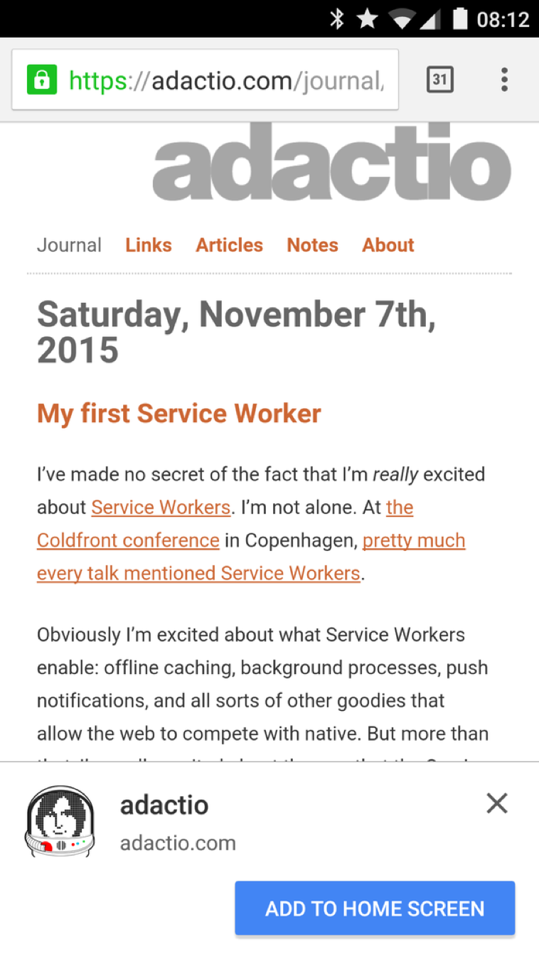
Usually a visitor to your site has to actively seek out the Add to Homescreen option from their browser’s interface. But Google’s Chrome for Android can actually prompt visitors to your progressive web app to add it to their homescreen (Fig 9.4).
In order for this prompt to appear, these conditions need to be met:
If your site fulfills those conditions, then visitors using Chrome on Android will be prompted to add it to their homescreen.
This is wonderful! By introducing this algorithm, Google found a way to promote progressive web apps. If a website fulfills all the criteria for the prompt to appear, then the user can be confident that it’s a site worth bookmarking. As a site owner, you get rewarded for following best practices. Everybody wins.
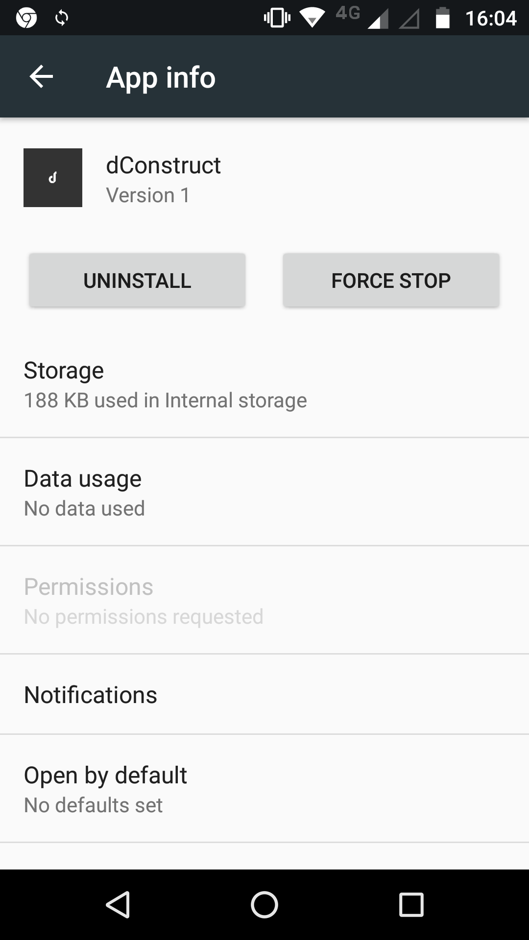
If you use a display property of standalone or fullscreen, then once your website’s been added to the homescreen, it will be treated exactly like a native app (Fig 9.5). It will appear in the app switcher, just like a native app. From the user’s point of view, there’s no distinction. And with features like notifications now possible through the web, there’s no reason for the user to prefer a native app over a well-made progressive web app.
The early days of the responsive web weren’t smooth sailing. Developers tried to make mobile-friendly sites by adding a sprinkling of media queries, but they were still starting from a desktop-first mindset. That led to frustration and disappointment. It took time for people to realize that a mobile-first approach made more sense. Even then, there was a tendency for designers and developers to focus on the specific dimensions of the latest and greatest mobile devices instead of letting the content dictate the breakpoints.
But we got there eventually. Over time, it became normal for websites to adapt to mobile devices, tablets, and desktop displays. Users came to expect that responsive behavior. Device-specific URLs—such as m-dot subdomains—became ever rarer.
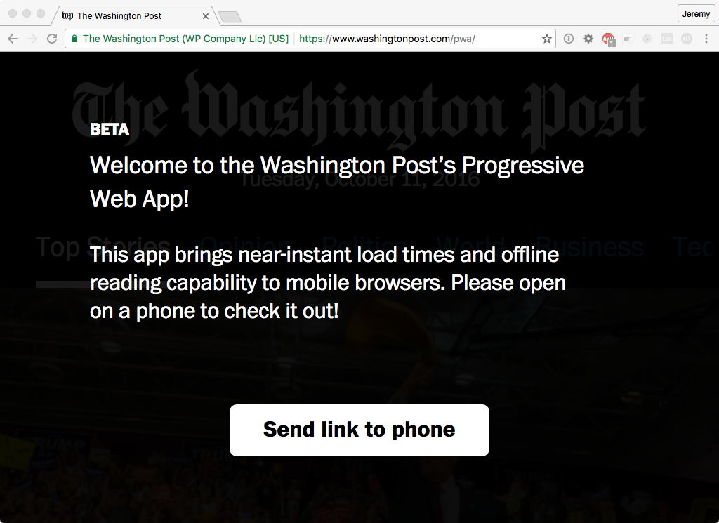
Progressive web apps have also been through an awkward early childhood. Many of the initial examples were made to only work on mobile devices, despite the fact that the “progressive” part of progressive web apps means they should work for everyone, regardless of device or browser (Fig 9.6).
Creating progressive web apps in silos, separate from the “real” website, feels like a step backwards to the days before responsive web design. As a minimum baseline, progressive web apps should be responsive.
There’s also been a tendency for developers to go a bit overboard with the “app” part of progressive web app. Many of the early progressive web apps were entirely JavaScript-driven and tried to closely mimic the behaviors of native apps. This led to a widespread misunderstanding that progressive web apps had to be client-side, single-page apps built from scratch. But as you’ve seen in this book, just about any existing website can be turned into a progressive web app by:
That’s it.
If you’re building a progressive web app from scratch, I recommend taking a layered approach.
It’s during that third phase that you can go wild with service workers. You can make sure that returning visitors to your site will have a fast, reliable experience.
We can learn a lot by looking to native apps. If there are design patterns or interactions that work well, we can apply them to our progressive web apps. But we should be careful not to simply imitate native apps wholesale. There’s one feature of the web that native apps can’t match: URLs.
Instead of making your users go to an app store, find your app, and then install it (assuming they have the bandwidth to do that), you can give them the URL of your website. You can give them the URL in an email, or on another site, or written on a poster. Once they visit your site—just once—they’ve got what they need. What an amazing way of distributing software!
If someone keeps returning to your site, maybe they’ll add it to their homescreen. That’s like installing a native app, but with one big difference: there’s nothing more to install. Putting your site’s icon on the homescreen is merely a convenient shortcut. There’s no hefty download. Everything’s already cached.
That process is also great for developers. Without app stores, there’s no need to go through an approval process to publish a progressive web app. And whenever you need to make a change to the site, you don’t need to submit an update for approval—you simply make the change.
Native apps rely on app stores for distribution. Progressive web apps use URLs. The World Wide Web becomes one big app store, but an app store where everyone is free to publish without asking for permission.
URLs are the standout feature of the web. We should learn what we can from the design of native apps, but let’s not lose sight of what makes the web great. I think it’s wonderful that we can create sites that provide an amazing, rich experience in the latest browsers, but still work perfectly well for older or less capable devices.
We live in paradoxical times. Web technology has never been more powerful. We can create incredible layouts with CSS; we can deploy lightweight optimized images; we can access device sensors through JavaScript APIs; we can even go offline using service workers.
Yet, for many people, using the web is painful. Despite all the wonderful advances in web technology, too many websites are bloated, buggy, and slow. No wonder people think that native apps are somehow inherently better—a typical web experience can be an exhausting trial, especially on mobile.
Sturgeon’s Law states that 90% of everything is crud. Alas, that certainly seems to hold true when browsing the web on a mobile device. You could see this as an opportunity to differentiate yourself from the competition. If 90% of websites are too big and slow, your nimble performant site should stand out from the herd.
But the truth is that we all suffer if the web is perceived to be unusable. We need to work to change that perception. It will be a challenge, but I think we can do it. Progressive web apps can light the way to a brighter future.
My friend Remy Sharp described the work ahead of us:
With time, and persistence, users (us included) will come to expect PWAs to work. If it’s on my home screen, it’ll work. The same way as any good native app might work today. (http://bkaprt.com/go/09-06/) Progressive web apps are driven by three technologies: HTTPS, service workers, and Web App Manifests. Mastering some of those technologies can be tricky, but not insurmountable. The real challenge is figuring out how to apply the technology.
There’s no one-size-fits-all service worker. Just as every website offers unique value and must be built with unique constraints, the corresponding service worker script needs to be written to match the site’s individual profile.
Service workers give you the opportunity to really make your websites shine. If enough of us rise to the challenge, we can make the whole web shine. Just think—by building progressive web apps, you can make a better World Wide Web. What an opportunity!
I can’t wait to see what you build.
Resources